* All designed while working at Hornall Anderson, UK.

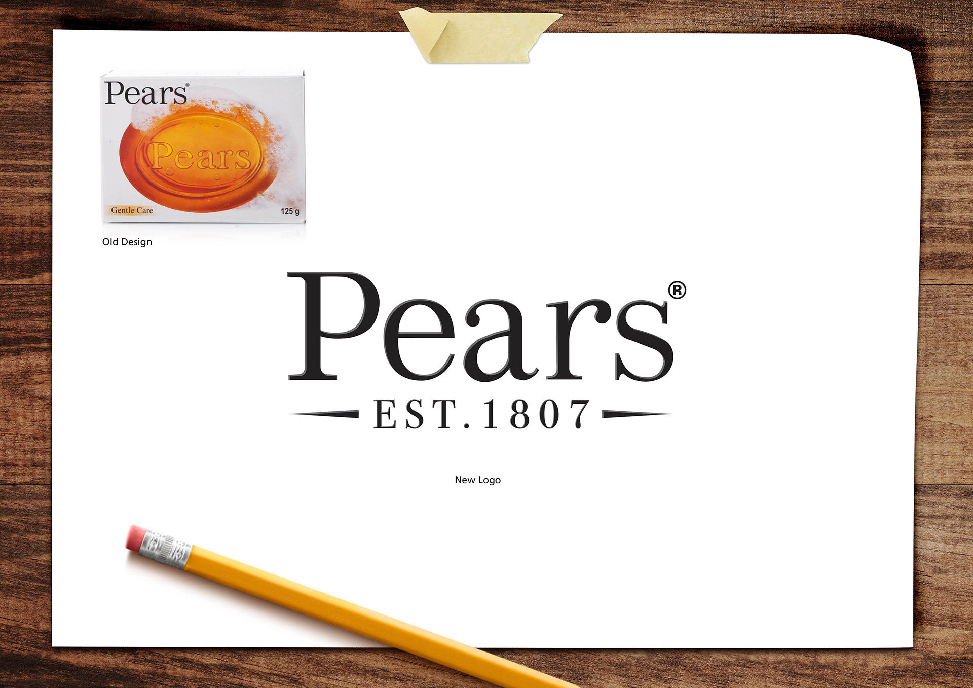
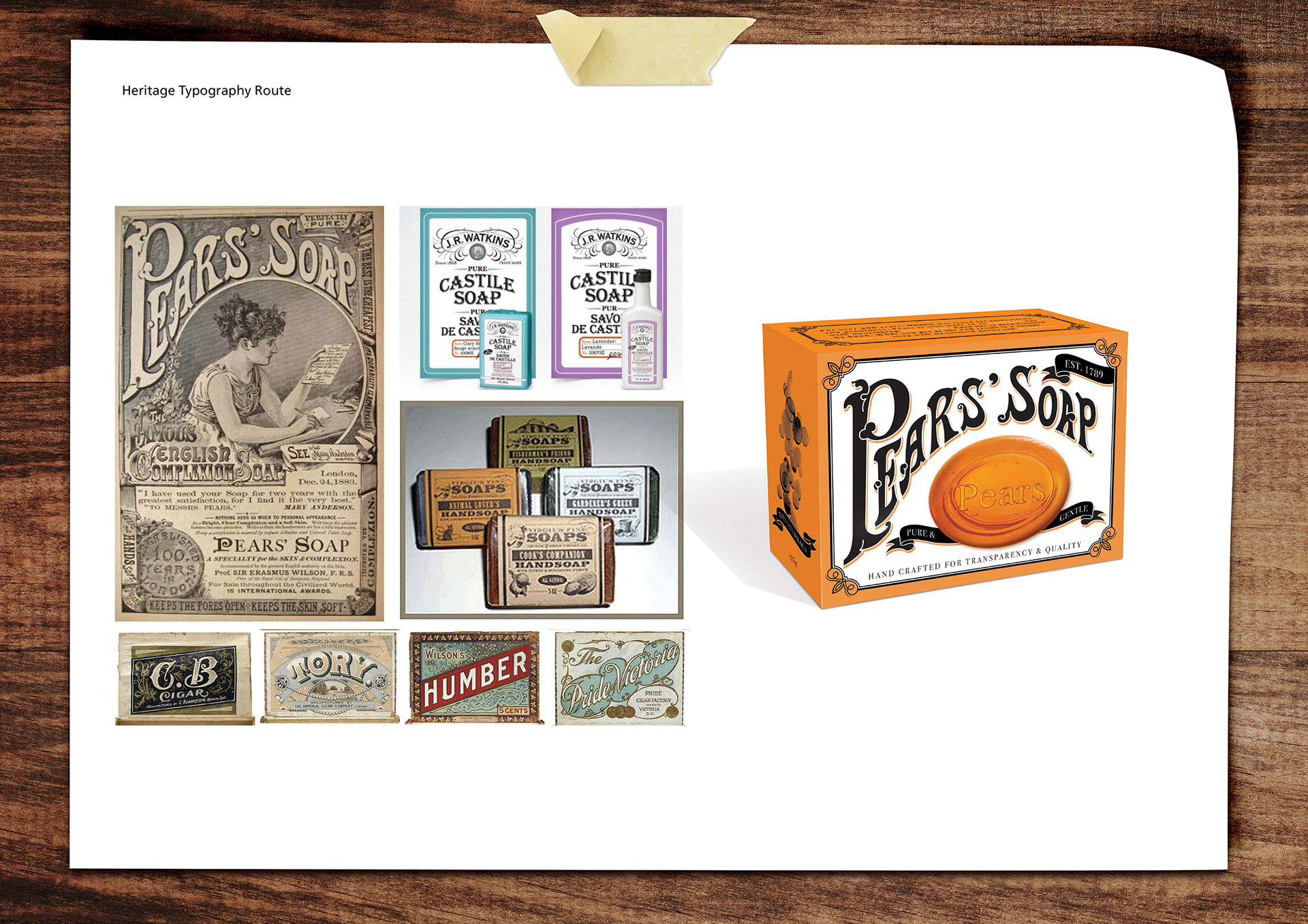
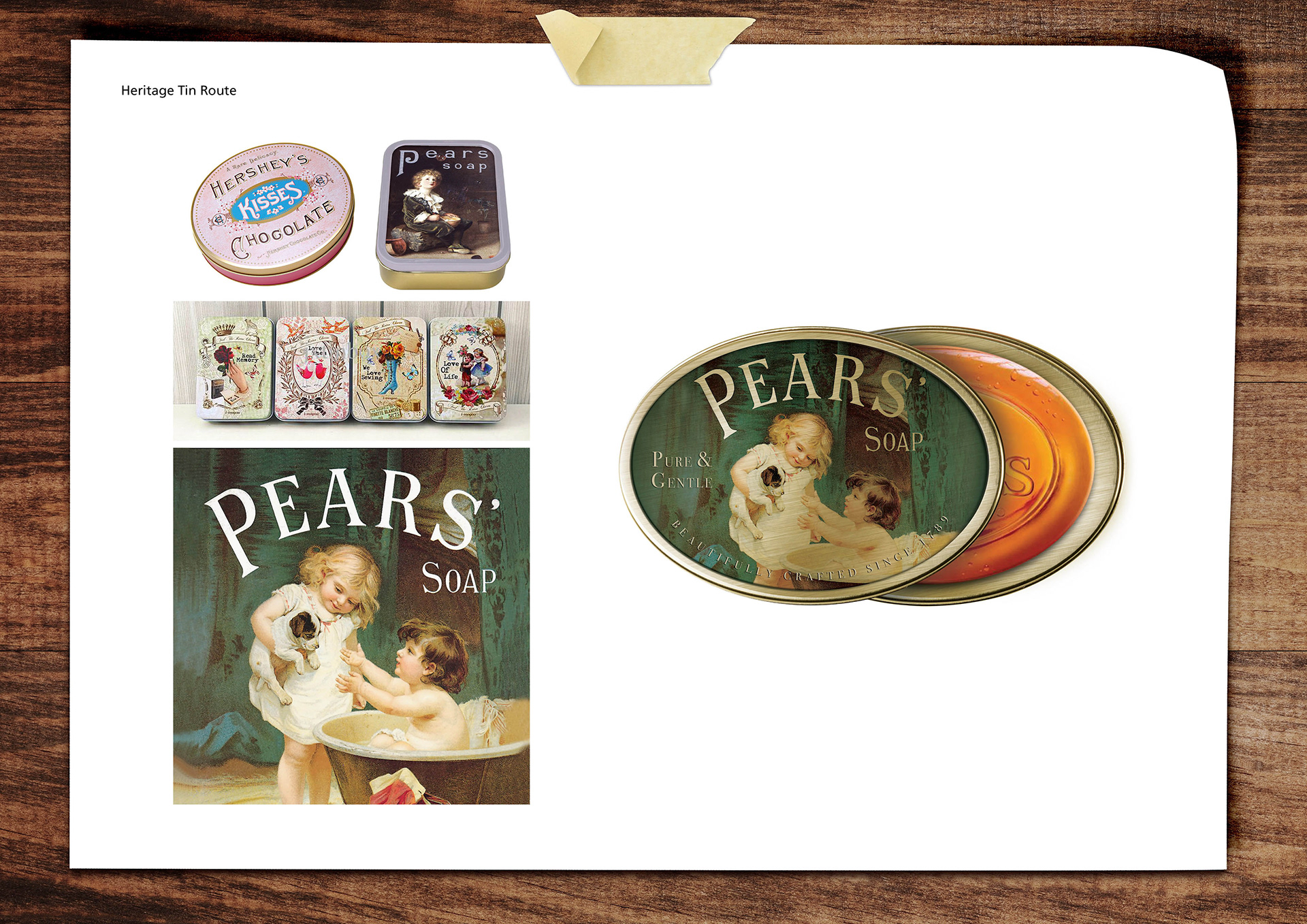
Below shows the old Pears pack design alongside the new logo. Plus some examples of my idea moodboards.


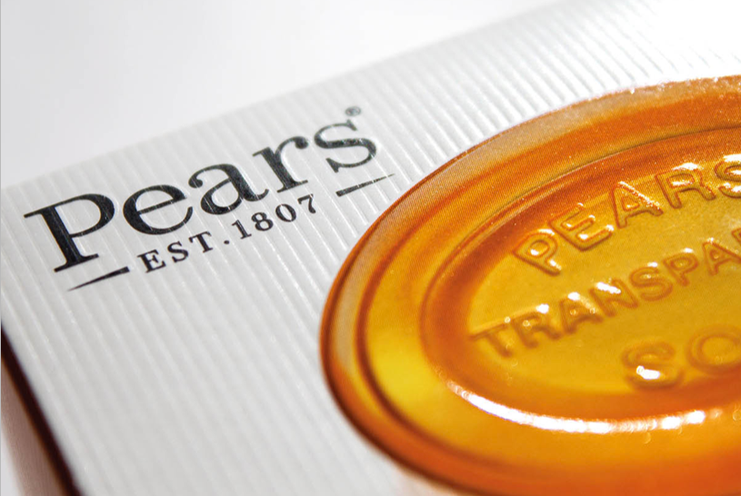
Pears wanted a pack re-design to bring it more up-to-date while not losing its important heritage, hand-crafted & transparency of the brand. The established date has been added the the Pears logo, a textured substate is used to bring in the handcrafted element and the new soap visual shows off the transparency buy using a glossy spot varnish. PACKAGING • STRUCTURE
