________________________________________________________
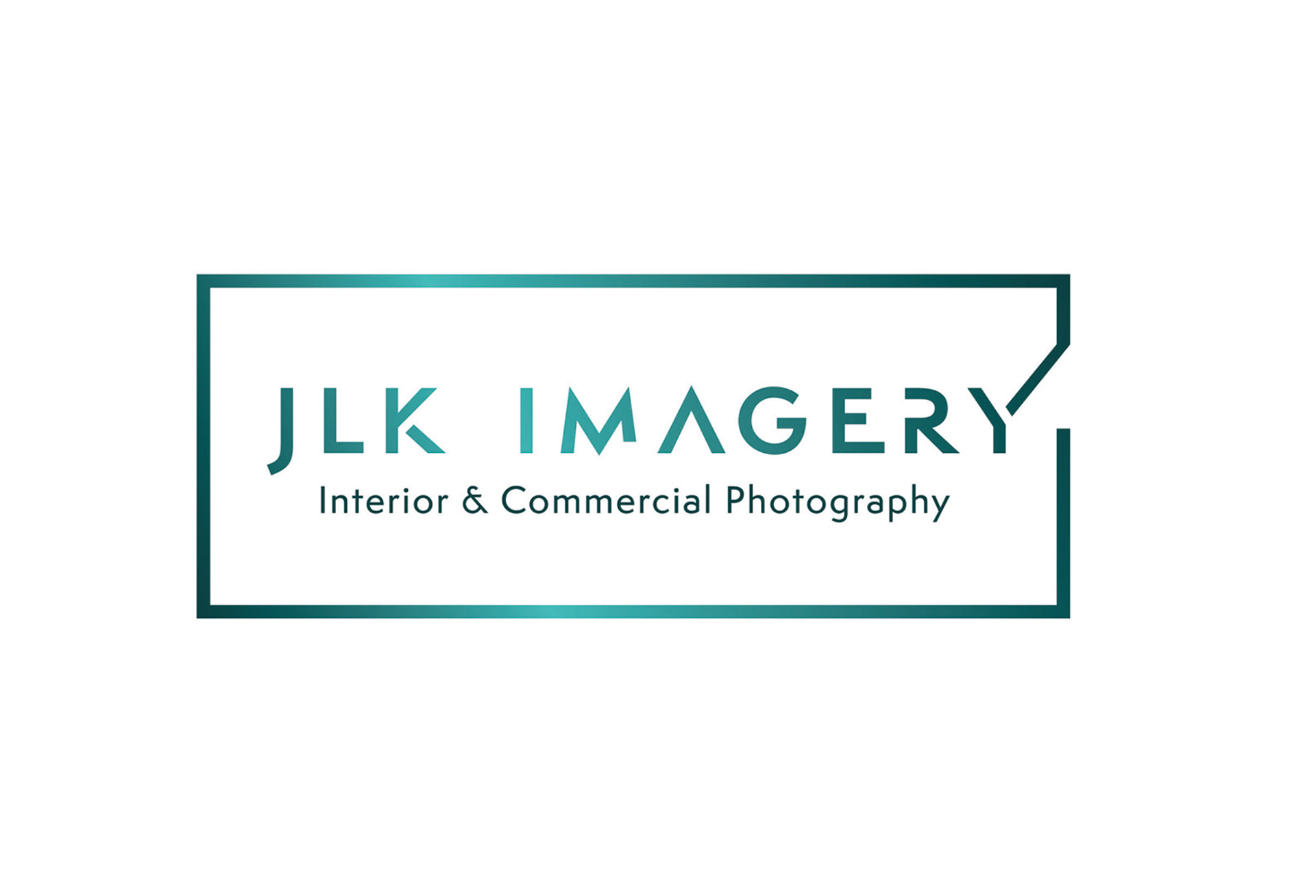
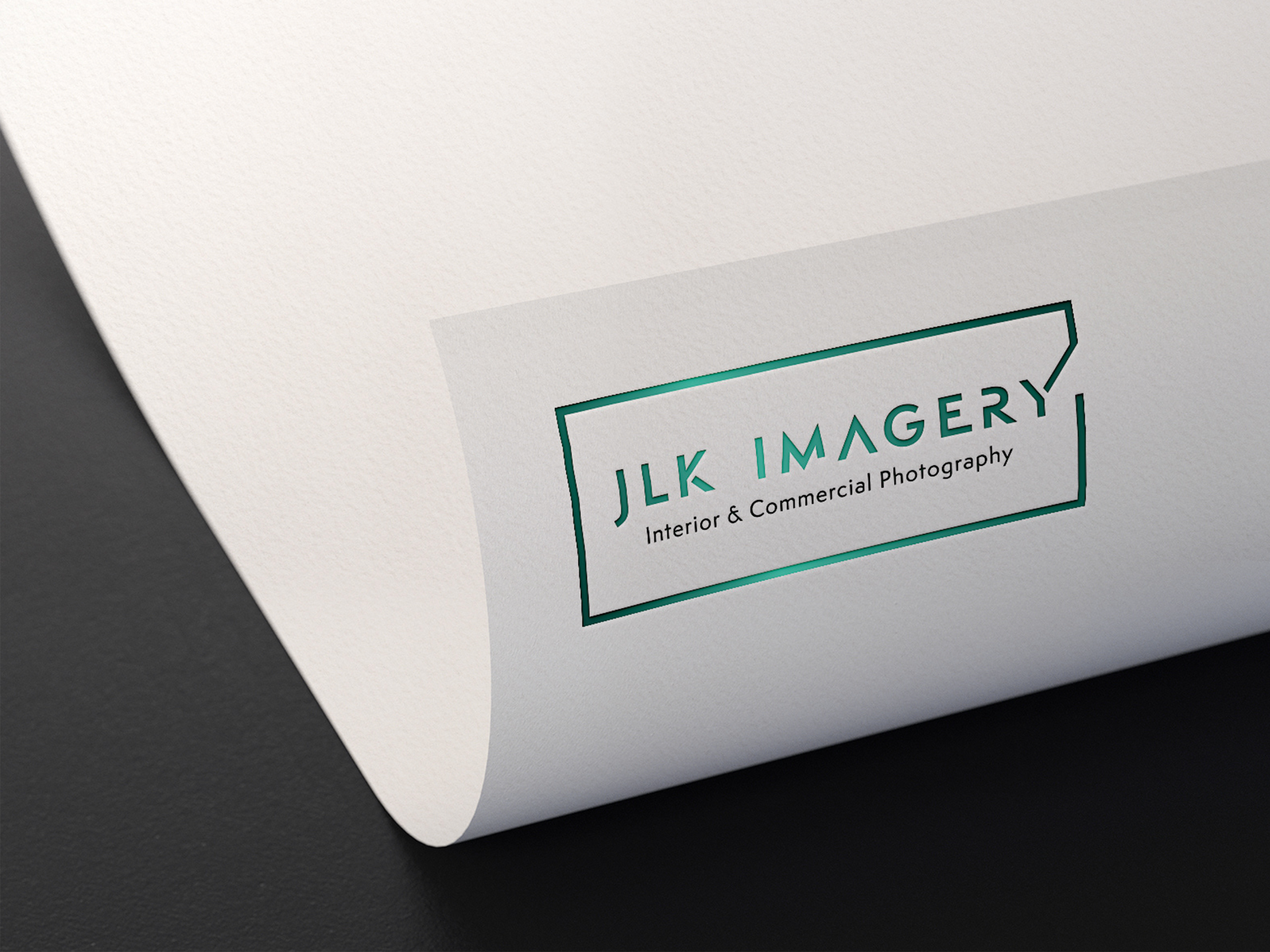
JLK Imagery Logo Identity
I was asked to create a logo identity for an Interior and Commercial Photographer. He gave me a great moodboard brief so I had a clear idea of the colours and fonts he liked. I adapted a font I liked to create the angular, cut out, architectural feel he was after. And as he is all about Interior photography I adapted the 'Y' to look like an open door on an interior room plan. Giving him a classy and premium logo that works on both light and darker backgrounds.

________________________________________________________
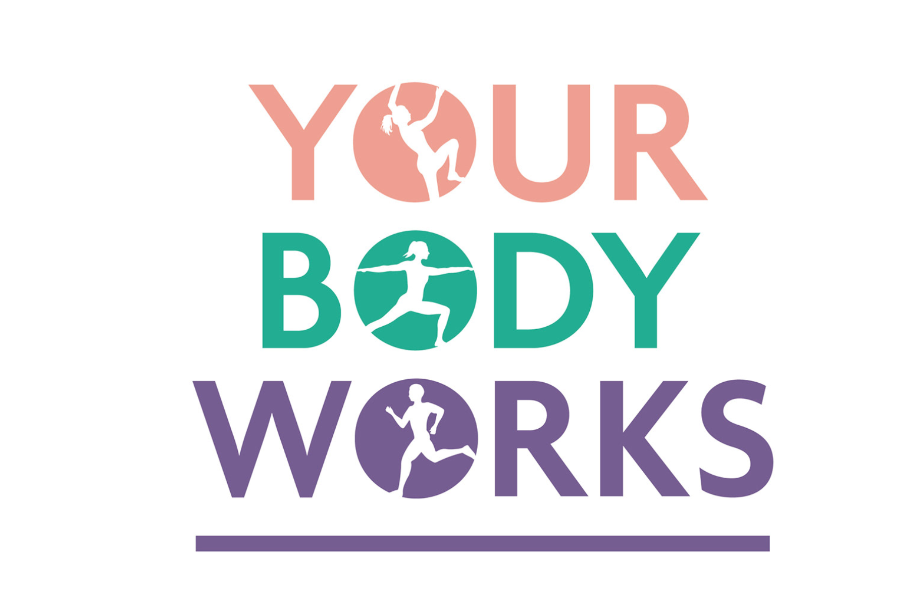
Osteopath LogoI was asked to design a logo for a lady who treats clients in Osteopathy, sports massage, acupuncture...and more. We went on a big journey with the brief... including a name change. This is the chosen logo and name. Its trying to say that once you have been treated your body works and you can be your active self again.

________________________________________________________
Film & Photography Logo
I used a camera frame, set at an angle for interest and placed in a vibrant colour for standout, to give this film & photography logo a brand asset that can used on its own, across his brand .

________________________________________________________
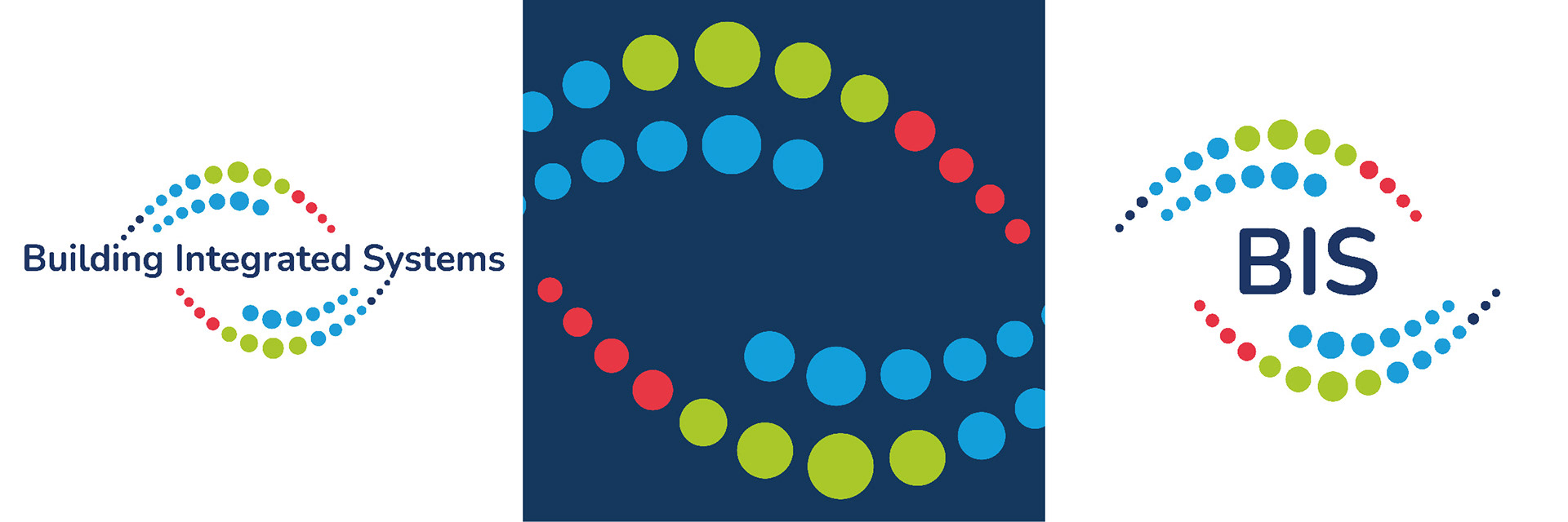
Building Integrated Systems logo
An updated logo for a company that specialises in installing Building management systems. It was an evolution of their current logo and the dots represent 'connection'.
________________________________________________________
Be You Logo
I was asked to create a logo for a spiritual healing and guidance business. She knew the colours she wanted to use but needed help with the design. I incorporated a mandala type of round pattern with the Lotus flower. Creating a soft and delicate logo.

________________________________________________________
Face Painting LogoI was asked to update a logo & create a leaflet for a local face painting artist. She wanted a circular floral design using flowers in the style of her creations.
The client then expanded her brand to include kids yoga. She wanted me to take elements from her face painting logo and adapt it for her new venture. I re-arranged the flower illustration to create a lotus flower. I simplified the design and softened the colours.

________________________________________________________
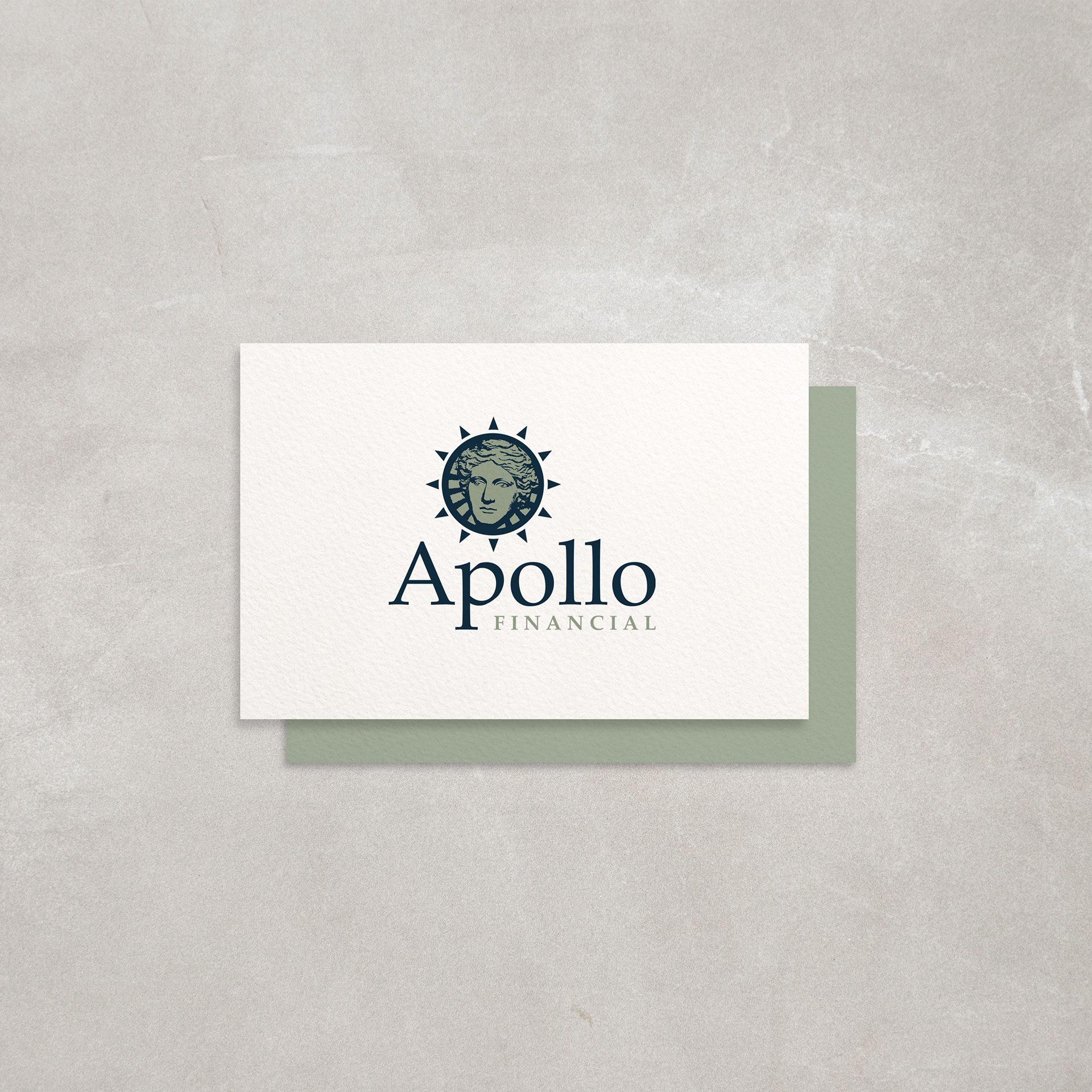
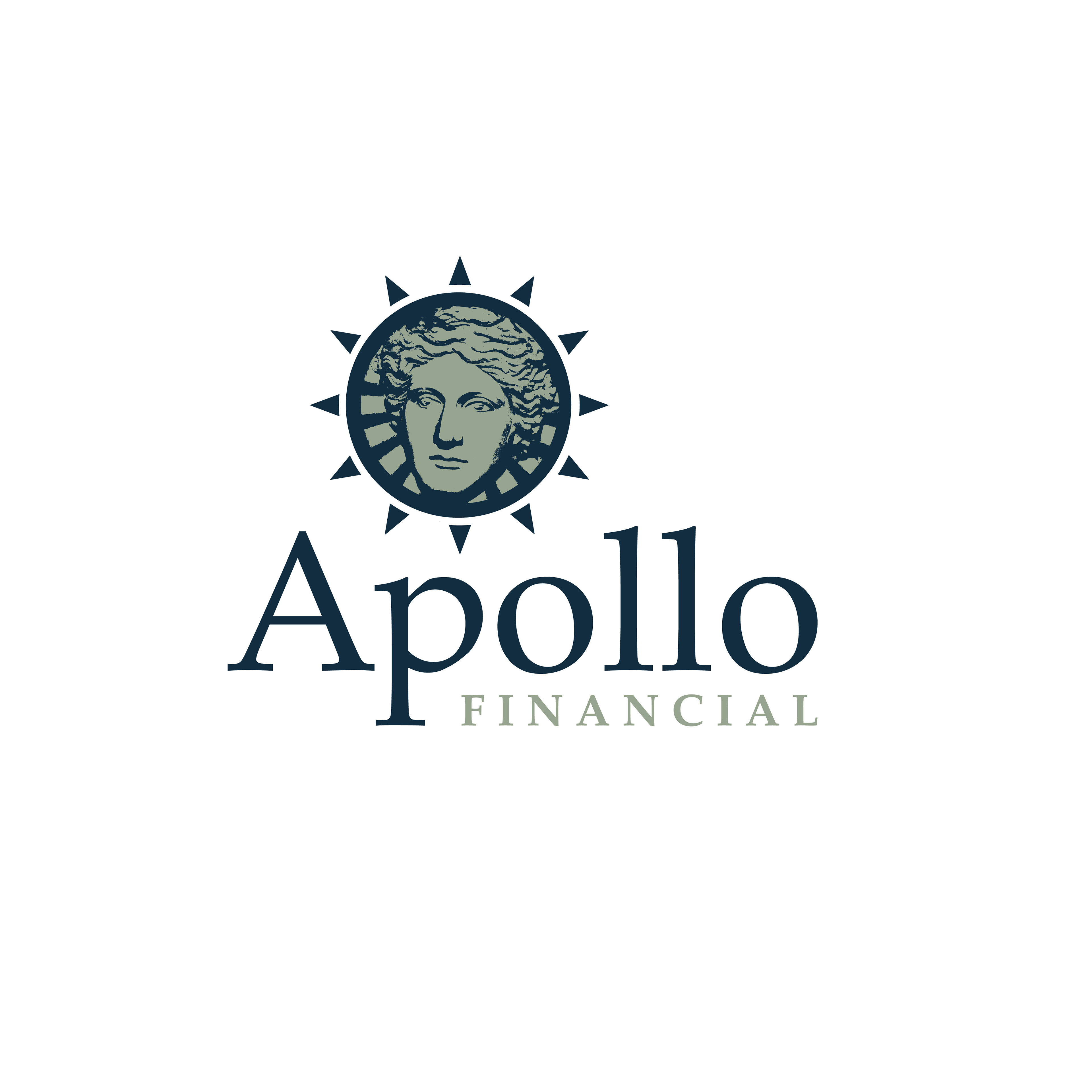
Financial LogoMy brief was to design a logo for a Financial company, based around the Greek god Apollo. They wanted a traditional and professional logo. My version of him is contained in a sun roundel as the Sun was a symbol relating to Apollo. The face/sun symbol could be used as a stand alone stamp without the words.

________________________________________________________
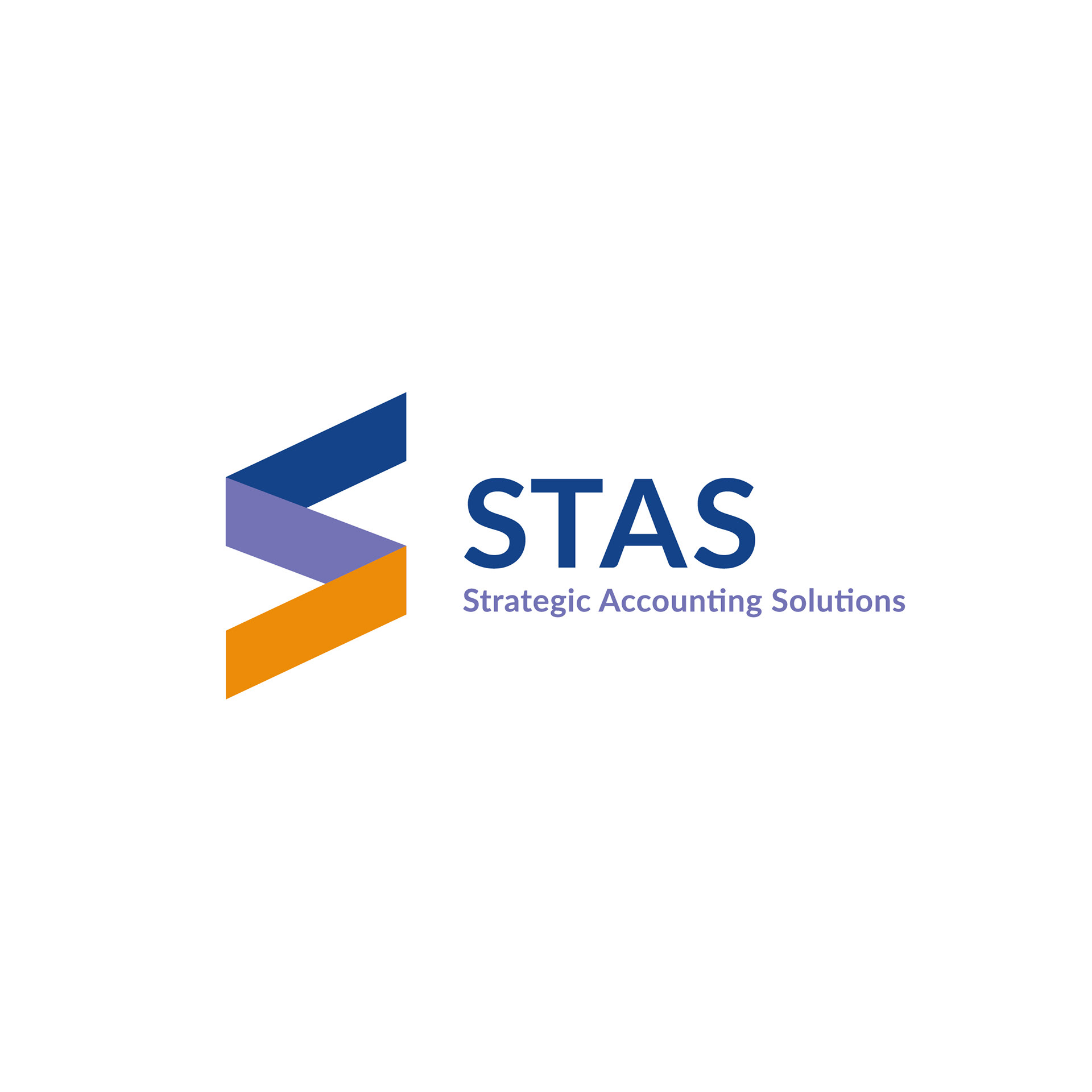
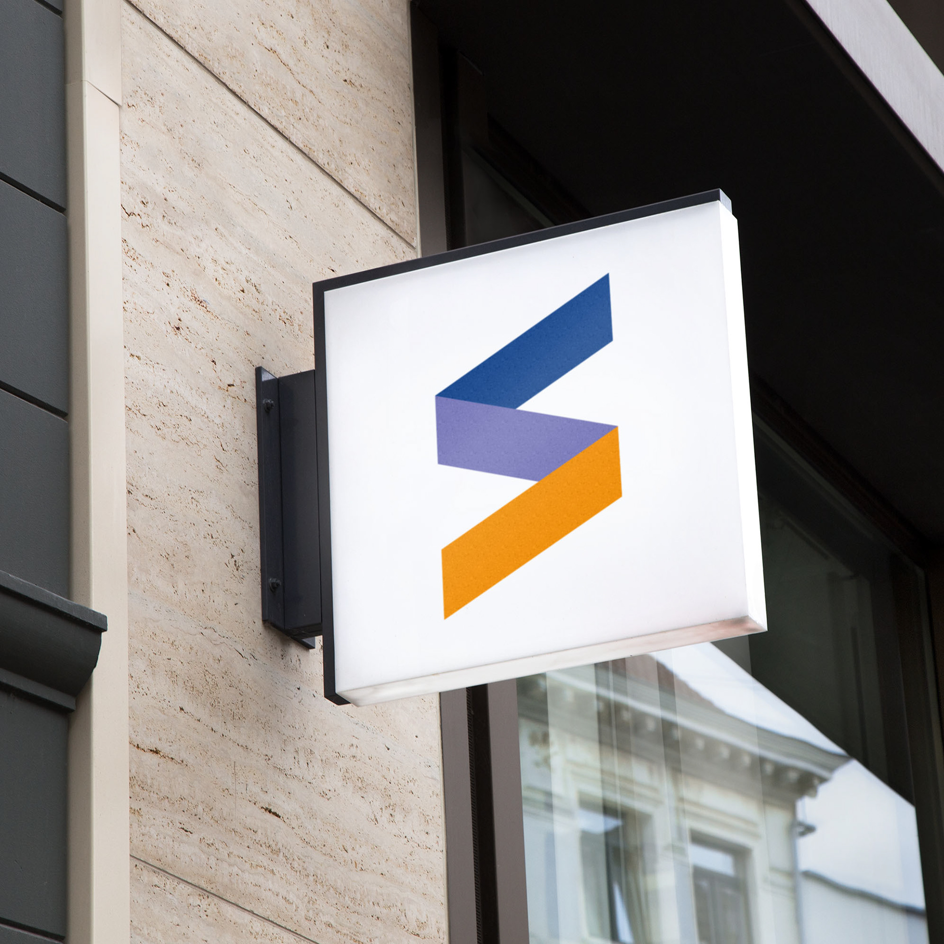
Accountancy LogoI was asked to design a logo for a new accountancy business. The chosen logo has a graphical 'S' icon which representing direction. The lines go in a positive, upwards direction.

________________________________________________________
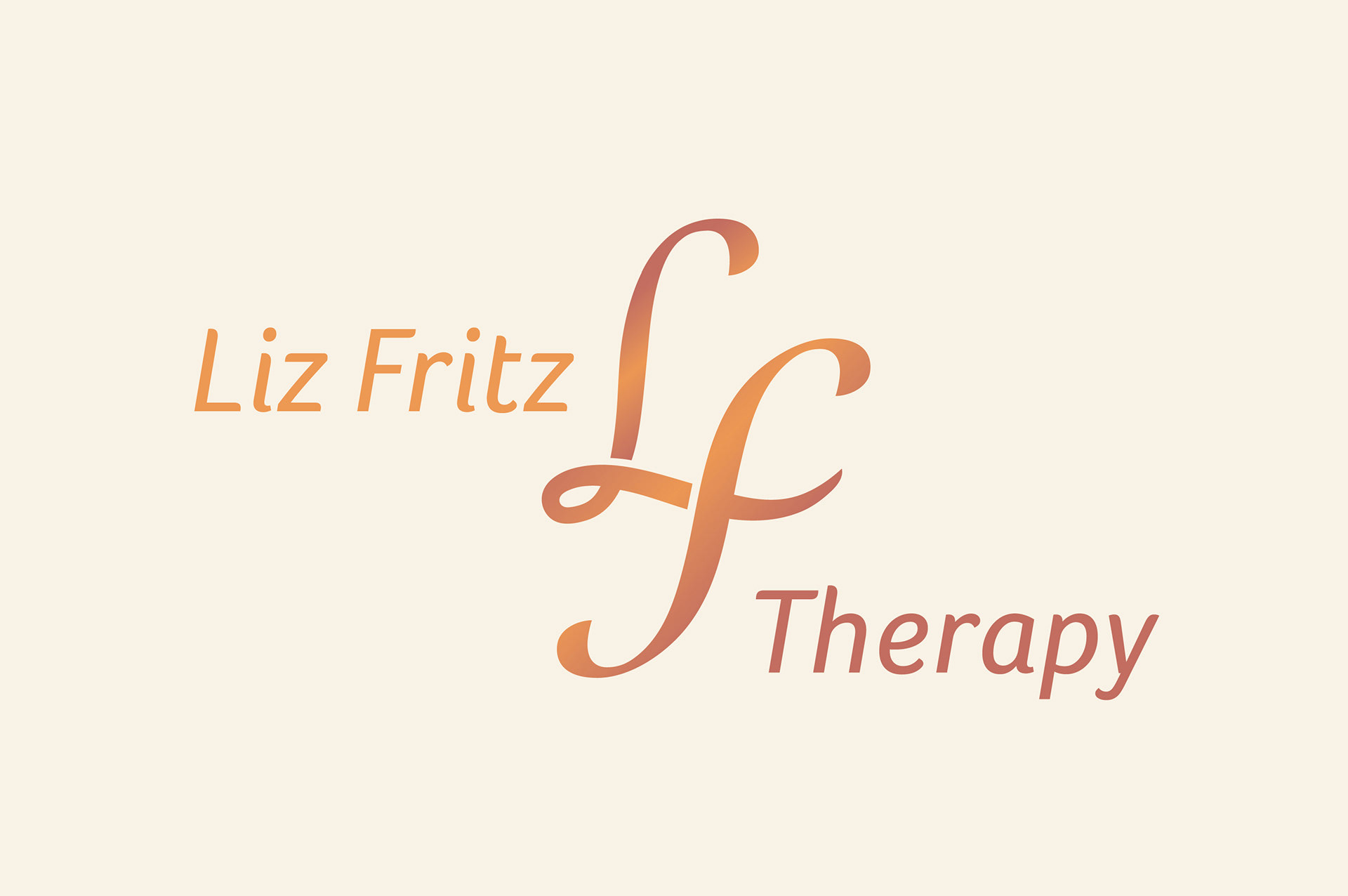
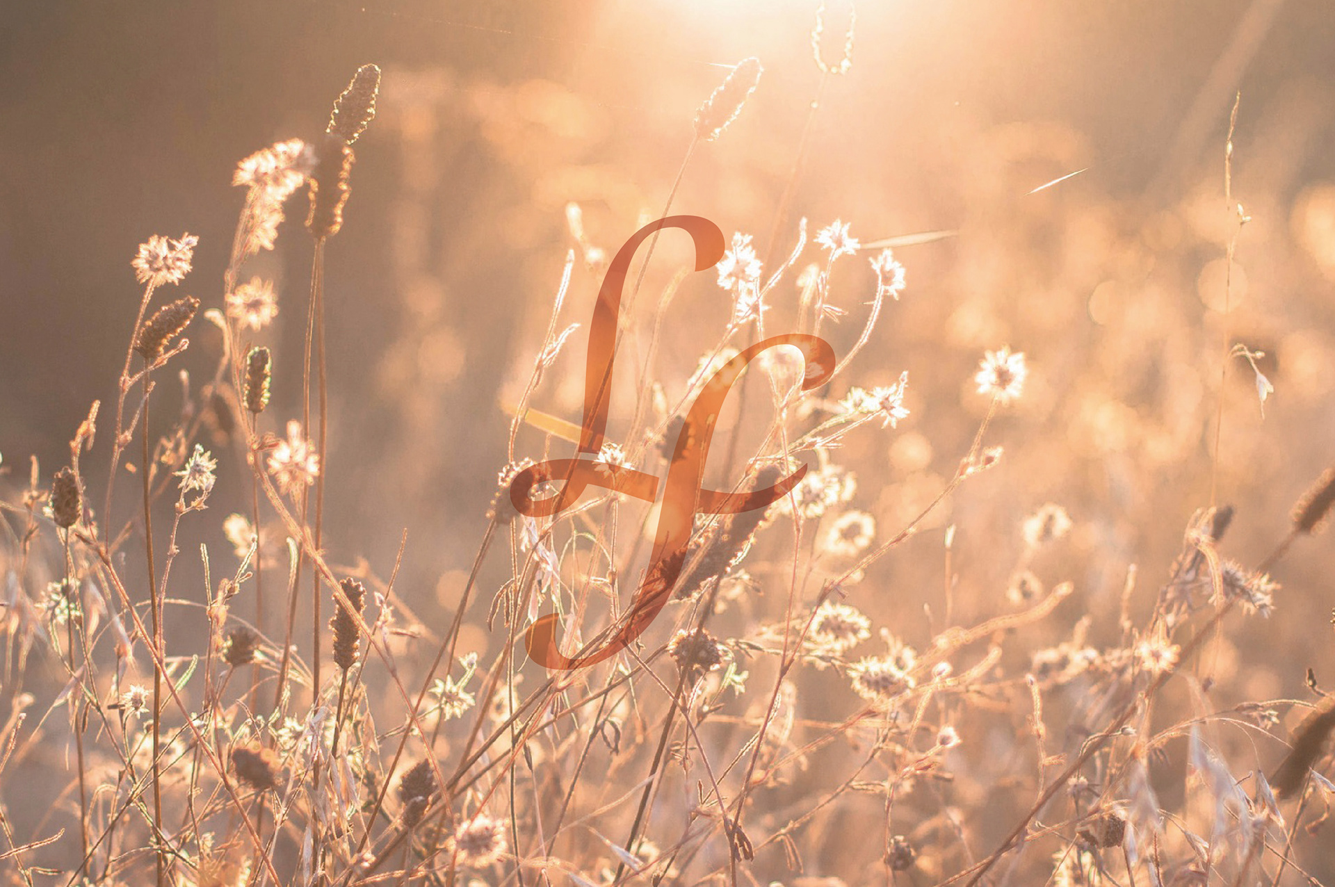
Therapy Logo
I was asked to work on creating a logo refresh for a Therapy business. She had a grasses image on her website which she wanted me to take inspiration from. I used the colours from this grasses image. The final logo was based around her initials which connects the L and the F in a lockup.
________________________________________________________
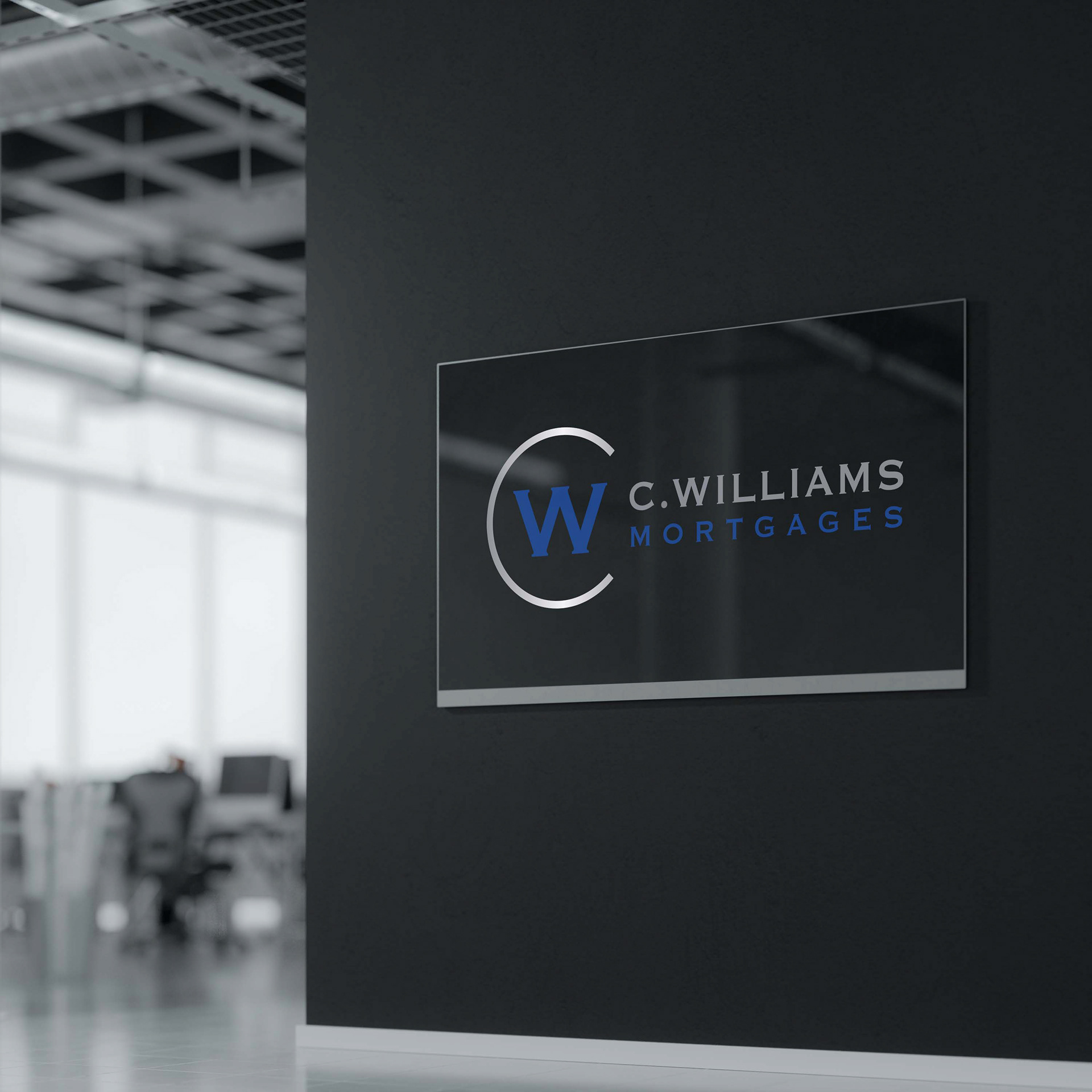
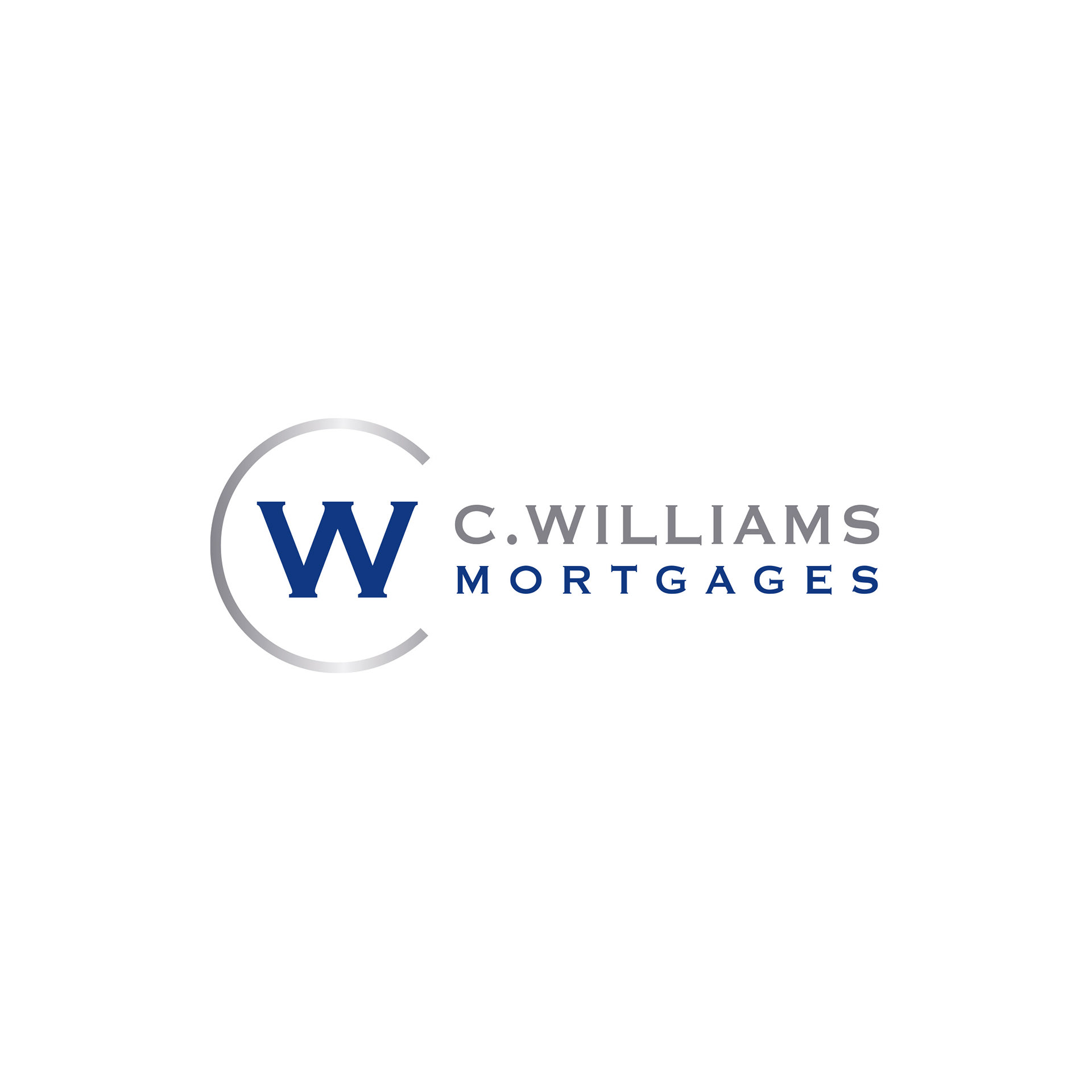
Mortgages Logo
The chosen logo is a smart, trustworthy looking logo. I have used his initials to create a stamp. The 'W' is placed in a circle 'C'.